Friday 1st December 2023
Advertising And Marketing
Lo: To explore the aims and conventions of print advertising
Advertising:
- The main aim is to bring attention to a product, service or issue.
- Global Industry which provides a major source of income too other media industries.
- We encounter it in many different forms at all times of the day. Advertising campaigns often utilise a mixture of media forms - print, TV, radio and digital.
- All adverts aim to communicate a clear message about the product, service or issue.
- Depending on the type of campaign, it might also:
- Raise Awareness
- Inform Or Educate
- Persuade Audiences
- Create A Unique Selling Point
Raising Awareness:

This advertisement tells us about the dangers of drinking and driving. It does this by using physical contact with a fist and somebody's face with vehicles drawn on them to show the collision but also the people inside of the vehicles.
Inform Or Educate:

This is an advertisement from when covid was a bigger deal. This was used to inform people of the current situation.
Persuade Audiences:

This advert is used to make people trust the product and therefore want to buy it.
Create A Unique Selling Point:
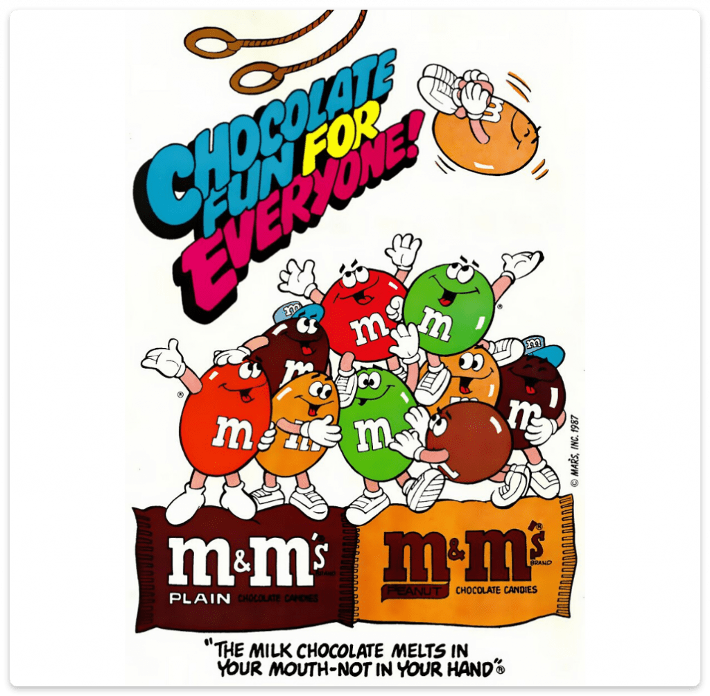
The fact they have used 'Melts in your mouth' makes you want these, as they have specifically used melting as if no other chocolate would melt in your mouth. It also shows the many different colour of chocolates that they have.
Wednesday 6th December 2023
Advertising And Marketing
Lo: To explore the codes and conventions of print advertising
Codes And Conventions - The expected elements that will be included in products from particular media forms and genres.


The main aim of this advertisement is to sell their own product and collect profit off of it. It communicates this through stating that it will give you a 'smile' through spreading the Nutella on the pancakes. They have used high lighting to show happiness and put the Nutella towards the middle and the pancakes off to the side a bit showing jolliness. This is also a hard sell as it gets straight to the point about what their product is.

1 - Imperatives, Persuasive Language (Triplets and Repetition)
2 - Persuasive Language (Alliteration)
3 - Facts And Information, Wordplay And Puns
Intertextuality:
- Modern adverts often make references to other media products, perhaps from other media forms or genres, that audiences can identify.
- This helps communicate a message quickly and memorably.
Charlie and the chocolate factory - Shows that Aldi has all that you need for Christmas.
Friday 8th December 2023
Historical Advertisements
LO: To explore historical adverts and their codes and conventions.
Wednesday 13th December 2023
Historical Advert Set Text
LO: To explore the context & content of the historical set text.
Do Now:
- They have constructed a happy relationship through a male and a female. They have showed that women should be very loving towards the males, seen on the advert. Women were stereotypically all about family and style. Where as men were stereotypically about their performance and getting things done if need be but also how much it costs. These suggest that women were interested in looks but men were interested in price and performance.
- They have done this by having the female leaning on the back of a man as if in a very loving relationship.
- They have reflected that they have space for anything and anyone, (trunk space and seating). This is their way of showing that their product is better than any other car that they will find.
- It is in back and white which reflects the age. Also gender roles in the 1950's is that women were meant to be seen as less than men.
Quality Street:
- Quality Street sweet tin made by Mackintosh. Originally created in 1936, inspired by then name of a play by J.M. Barrie.
- In the 1930's, only the wealthy people could afford chocolate boxes but the creator Harold Mackintosh aimed to sell them at a more reasonable cost to appeal to working families.
- By the 1950's, when this campaign started, society was in a post-rationing period where luxuries were once again becoming an acceptable part of grocery shopping.
Historical:
- The icons of the Quality Street brand were two characters from the Regency era of British history. In the Regency era, Britain went through a period of elegance with regard to Fine Art and Architecture.
- The Regency era could also be compared to the 1950's for its significant social and cultural development. Between 1811 and 1837, the country was under the rule of Prince Regent and developments in technology (e.g. the steam-powered printing press), fashion and architecture were mirrored by a population boom. These similarities can be compared to England in the 1950s.
Social & Cultural:
- The 1950s saw a change in "high culture'", a time where fine art, decadence and theatre that had previously only been accessed by the upper classes and those with money were now going to the mass audience.
- The Conservative Party's 1951 election campaign was spearheaded by the slogan 'Set the People Free', and this supported drastic change as entertainment and arts became more accessible and affordable.
Consider how Media Language creates and communicates meaning:
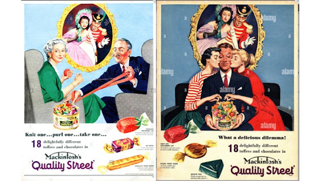
Structure And Design Of The Advert - It is a simple image with text towards the bottom of it talking about some of the treats they supply/have. The texts inform us of the amount of sweets there are to choose from in their Quality Street boxes. Everyone is glaring their eyes at the sweets as if wanting to have them all. They don not need much text as they are very popular at this time.
Typography - They have used bold and big numbers when they say '18'. This is referring to how many different choices they get to choose from when they want to have a chocolate or toffee. They also attempt to make it stand out to how many other treat boxes would have in comparison to the amount they have. Written in serif and sans-serif, this can show a more modern period which shows it is a new idea of it being affordable for everyone.
Persuasive Language Techniques -They have used alliteration when saying 'Delightfully Different' this is used to give the buyer a different sort of feeling when thinking of purchasing them.
Consider how Media Language creates narratives:
Connotations - the golden 'halo' above the mans head, the paining frame, is showing the audience that he is a good man. The female characters are dressed up as the 'sweets' which tells us that women are stereotypically seen as sweet but also they are objectified.
The Dilemma - He cannot choose between which woman he wants. 'Delicious Dilemma' can tell us that he has a dilemma about what sweet he wants.
Class - The male is showing a high status as seen by his suit and tie which makes me think that he is a business man or something like it.
Wednesday 10th January 2024
Historical Advert Set Text
Lo: To explore the context and representations in the historical set text.
Do Now:
- The two females are kissing the male but are also picking out a treat from the Quality Street's box.
- The two females are dressed as some of the treats.
- The man is holding the box of sweets with two girls on either side of him. This tells me that he could be quite wealthy but doesn't have to be as the sweets are for pretty much affordable for everyone.
- The man is sort of leading a wealthy and good lifestyle as we can see him wearing a suit and tie and has a 'halo' behind him which is in the form of a picture frame.
- I think that they are trying to portray the message of there product being happy and that everyone wants them but also that it is affordable for anyone as we can see by their types of clothing. My reasoning for that is because the females are wearing a more low modern outfit where as the man is wearing a suit and tie which makes the viewer see him as more sophisticated and important.

The 1950's saw a change in "high culture", where entertainment and the arts became more accessible and affordable for everyone. Therefore the cultural status associated with the regency characters adopted by Quality Street to advertise their products, was now within reach of the 'everyman'.
The post-war culture of strict rationing and state control was coming to an end and the new government set to increase individual freedom.
Items that had only been seen from a distance during war time Britain started to become more widely available and the country was entering a period of increased affluence, with many of the old social and cultural structures were starting to be challenged, particularly by the young.
Advert 1 - Women are represented as being the role of cleaning and it says 'She'll be happier with a hoover' which tells me that back in the 1950's, they saw women as being the ones responsible to clean and tidy up after people. The advert is directed towards married men. telling me that they had more power as it would be expensive but it is directed to men saying that they are the ones making money.
Advert 2 -Women are represented as dependant as she is leaning on her husband. However, men too are seen as dependant but also the male looks more powerful as it says 'The chef does everything but cook, that's what wives are for' this tells us that the man does everything else but wives are for cooking. The advert is directed towards men once again showing their power as the ones who make money, which was very traditional as women weren't seen as having big jobs.
Advert 3 - Women were represented as the ones having to look after the household and the children was a very historical role that they were given. They young girl is seen holding a tray of what I can presume is ice cream, this tells us that she is taking after her mother and learning to obey for when she gets married which was expected for women to do. The young boy is seen playing with a plane which is a very stereotypical male profession for the 1950's.
Advert 4 - Women are represented as 'where they belong' is home. We can see this as no-one is wearing the shoe so somebody is not using it meaning it is most likely at home, so it is saying that she should stay where she belongs which is presumably at home. the fact is tells her as 'her' could tell us that she is an object for her husband to use.
Advert 5 - Men are represented as the dominated sex as we can see that the female is bowing down to him and giving him food which also suggests the girl is there for being loyal towards her husband.
Advert 6 - The fact that the male is wearing a tie shows that his status is really high and that he has more importance when it comes to work. However, the female has grubby clothing on which tells us that she is seen with a lower status than the man. She is also seen cooking which gives us the idea that she is stereotypically seen as needing to cook for a male.
The male gender role in the 1950's was that they were more powerful than women and that they would be the ones who were responsible for making the money at a job which would be just the males as females were told from propaganda that they belonged at home. Men were supposed to be dependant on their wives cooking them food and nurturing their children for them. On the other hand, women were seen as objects, we can see this where in most adverts they would present them as 'she' or 'her' and they expected to take care of the household and raise the children at home and teach, if they had daughters, how to do things for when they get husbands later on in life.
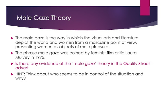
The man is framed in the centre of the advert, controlling the situation. This tells us that he is the more dominant figure in the advert as being in the centre shows his status is high but also his power. However, the women are on the side showing that their status is a bit lower than the mans if not the same.
The man's costume is a suit which has connotations of the modern businessman. This tells us that he has got a job which was a stereotypical thing for men to have back then as women were unable to get jobs, if not rarely. it also shows that he is quite wealthy and has a lot of money, this is backed up with the box of treats overflowing.
The women in the advert are both dressed like the sweets and kissing the man as they reach towards the chocolate tin in his lap. This tells us that the women are seen as objects as they are compared to the sweets as they are dressed like them.
The man is looking down at his lap where the product, he is holding is purposefully placed. This is a 'phallic' symbol. This shows us his dominance over the females.
Friday 12th January 2024
Historical Advert Set Text
LO: To explore the possible exam style questions for advertising.
Do Now:
1 - The male is the dominant gender in the Quality Street advert as we can see they are wearing a suit and tie as that can show a high status and also wealth. He has been centrally framed which means his importance as he is the first thing that you see. Also, the women are objectified as they are dressed as the sweets.
In the Quality Street advert, men are presented as the more dominant gander. We can see this in the way that the man is centrally framed in the centre, which can show us that he is controlling the situation. The man is wearing a very formal attire which can have the connotation of the modern businessman. This tells us that he has a high paying job which wasn't very stereotypical for women back then so it makes sense that it was made a man having the job. The man is looking down at his lap where the product is overflowing, this can show his wealth, but he is looking down at the box which gives us the idea of a 'phallic' symbol.
However, the women in the Quality Street advert are represented as the less dominant gender. The way in which we can see this is how the women's attire looks like a link towards two of the wrappers of the sweets. This can tell us that the women are being objectified and that they were seen as objects towards the male gender in the 1950's. The women are also kissing the man on the cheek and also reaching for the sweets that he is holding, this could tell the viewer that the gender of women is represented in the advert as needing to rely on men and be all over them with love, which we can clearly see is being done in this advert as they are both kissing him.
Wednesday 17th January 2024
Analysing Adverts
LO: To build the skills needed to analyse and evaluate adverts
Do Now:
The difference between connotation and denotation is that connotations are deeper meanings of things and what they represent. E.g. red can give us the connotations of love.
Where as denotation is the literal meaning of something and not how is can represent something else. It is just basically making an obvious observation. E.g. if there was a picture of a flower, you would say something on the lines of 'It is a red rose'.
Connotation Of Advert 1:
- Uk royal guards reassuring them that it is the 'Uk's safest broadband'. This makes the viewer see it as safe as it can be in the UK. It is specific to the UK as it has stereotypical guards, wearing the black hats. They chose neon colours which have connotations of futuristic technology.
Connotation Of Advert 2:
- The text suggests that it is more than just 'a piece of meat' It is describing it as mouth-watering to grab the viewers attention on how much they really want it. It also asks if they are 'Mac' enough which, if we change the 'c' to an 'n' it is asking if we are 'Man' enough to try something 'juicy' as it describes. This makes us believe they are asking if we are strong enough and links towards male gender characteristics. The connotations of the logo automatically tells us what advert is is representing as it is a very well known brand. It is also placed in a red velvet bed, this can tell us that is is of high status and luxurious. They used silk and velvet which can show wealth. 'Stop staring at me as if i am just a piece of meat' is saying that it is being compared to a woman. it is also trying to show that could suggest desire.
Connotation Of Advert 3:
- The fact that the car has other cars in it can tell us as the viewer that it has a lot of room in it as it can fit multiple cars in it. The advert states 'a sporty car full of history' this appears to be true as it has got makes of older car inside of it which can tell us that the more modern car still has some features of more historical vehicles. they are all cars that look like they are more for racing which could also tell us that the car is going to be quite fast and it is to be used more for going at a quick speed. It shows the progression of sports car linking back to many years ago and getting more modern, the bigger the car gets. This is a perfect representation and example of how the history of race cars is progressing greatly. The connotations of the number 1 on the more historical cars, show us that they are the best.
Connotation Of Advert 4:
- The advert shows the Hulk with a plaster around his finger. The box with the plasters in it has the words 'Flexible Fabric' this is shown to be true as the Hulk is very muscular and larger than the average man which does show its flexibleness as it is able to reach around his whole finger. Also, the Hulk is a very recognisable character which can be recognised by young and older people.
Positive:
- Disabled
- Inquisitive
- Curious
- Interested
- Handicapped
Negative:
- Handicapped
- Nosy
- Crippled
- Retarded
Thursday 18th January 2024
Exam Style Question

They have used layout in a way that makes the viewer look at in a 'Z' formation. They have placed the three people in the centre to draw people's attention mainly on that certain spot to grab their focus on their advert and to attempt to make their advert stand out. They have laid the people out with the two females on either side of the man which shows how in the 1950's women were relying on men to be there and to assist them. We can also clearly see that they are mean to be all over men with love and compassion for them because they were seen as the less dominant gender back then. This was important for men in the 1950's as they mainly relied on women more than women relied on men. This is made obvious with how other adverts from the 1950's are mainly about women belonging at home or in the kitchen or other things like taking care of the children. This further tells us that women did more than men did as they had to do many things at once, including cooking, housework, etc. As we can see, they have placed an example of three sweets at the bottom of the advert. Although this can tell us how women were objectified as a gender, they are using it as just another way of making it clear of what kind of sweets they have but also how their box of treats are different to others and how they stand out.
We can see that in the Quality Street advert, they have used a variety of different language techniques to make sure that their advert stands out and can bring peoples attention to their sweets. We can see that they have put their brand name 'Quality Street' in bold letters. They have done this to make it known to their observers of what brand they are quickly and not to make people try to figure it out as they read the advert. We can also see that they have put their brand name in purple which also makes the brand name stand out but also, the colour purple is the same colour of their sweet boxes, in other words, they have used the purple as it is their signature colour. We also know that the colour has got connotations of royalty, wealth and extravagancy which are key points and characteristics of the Quality Street sweets. At the time, Quality Streets were seen as a posh and fancy thing to have, even though it was affordable for those with less money too. They have introduced the question of 'What A Delicious Dilemma?' this is referring to the man as we can see that he is stuck with a choice of the two women on either side of him, or the box of treats which are set on his lap. This question was brought up to compare between the two, saying if they would either have two girls or a box if Quality Street treats. This is also objectifying women as it is saying that two women is the same comparison as a whole box of Quality Streets.
Friday 19th January 2024
The Language of Adverts
To build the skills needed to analyse and evaluate adverts.
Weasel Words:
- Weasel words are ambiguous words that are used to “Weasel” out of something.
- These are words like, ‘Probably’ ‘May’ ‘Often’ and ‘Somewhat’.
- These words enable advertisements to make claims without promising anything.
“This may be the best soup in the world”
Weasel Phrase Two:
“Probably the BEST-selling bike out there”
Wednesday 24th January 2024
Contemporary Adverts
LO: To understand the techniques used in contemporary adverts.
Do Now:
- The colours pink, purple, etc are stereotypically feminine colours.
- The colours blue, green, red, etc are stereotypically male colours.
- Men were stereotypically strong.
- Men were meant to make money and women were meant to look after children and the home.
- Women like make-up.
- Men are more intelligent.
- Women are bossy and men are direct.
There are differences in the more modern adverts compared to the historical adverts, these include:
- Colour palette
- Typography
- Image Manipulation
- Photography / Digital Images
- Context & Representations
Advert Comparisons Task:
- We can see that the two adverts are aimed at opposite genders as we can see that the advert on the left has a women in white and black sitting on a yellow car. This tells us that the advert is aimed towards women, we can see this as there are a few stereotypical feminine colours used like yellow for the car and purple for the wall. It is also stating 'Life's too short to wear a boring car' this gives us the impression that they do not take themselves seriously, seeing as the photos look silly and not serious. Although, it could also be saying that it is for women as wearing and staying with a newer style is a stereotypical feminine thing to do. On the other hand, the advert on the right is using more masculine colours, like blue, red and green with a man jumping as if for 'joy'. The advert also says 'Sport Up' which is a more masculine thing to do and which further directs me to believe that it is aimed at men.
- They have used a very bold kind of font to show how important it is to read it and then they have put a bit of a backstory in small writing to show how their life was before buying the car and how it has changed after purchasing the car. This tells us that just buy purchasing their car, your life can change massively or a small amount but ultimately it will still be changed. maybe you go from looking less fortunate to looking extremely wealthy. Either way, they are trying to use their sort of backstory as a way of showing their intentions of it changing their lives for the better.
- These two adverts do not look like other car adverts as other adverts would involve a car with possibly some information about said car. However, these adverts just talk about why they should have the car saying things along the lines of 'Life's too short to wear a boring car' which basically says that the car you had is not as stylish as the car you could have which is a 'FIAT'. Similarly, the advert on the right talks about 'Sport Up' which makes me think that their intentions is that men will want a more 'sporty' vehicle. In other words, they want mainly men to think that they can switch out their older sporty car and get a much more modern and newer one to drive in. In conclusion, women are represented as wanting a car to seem more stylish and fashionable as that is a very stereotypical thing for women to want and men are represented as wanting a car as it being called a 'sport car' which tells us that men were more stereotypically sporty and loved sports a greater amount more than women so far that they would like to get a sport car and be 'sporty'.

HomeWork: 28/01/24
- 'This Girl can' is a campaign and movement by Sports England. It was developed so women could feel safer when they were doing things like working out. 22% of women reported that they were worried of stuff like sexual harassment when working out. In the advert, they use regular women but also women with different body types, ethnicities, etc. The =y have done this to appeal to all women no matter what they look like. The 'This Girl Can' was launched in 2016, and was done to tackle the problem with women working out and not feeling safe or confident when doing so. It was funded by the Nation Lottery. The advert is empowering as it shows how women, no matter what they look like, can do the same things that men can do.
Friday 27th January 2024
Creating Adverts
Lo: To use our understanding of advert conventions to create advertisements.
Do Now:
Print Advert:
- Lots Of Colour.
- 1 Main Cover Image.
- Logo.
- Slogan.
- Product they are advertising (Product Shop).
- Anchorage text, usually a tag line or some sort of play-on-words associated with the product.
- Sans Serif font is used more because it is more modern. Also helps people with dyslexia to read.


Sell Line 1:
'NO rain. NO hands. NO problem.'
Sell Line 2:
'Take a dip into our new sale'
Sell Line 3:
'Be the pigs in blanket'
Weasel Phrase 1:
'This could LEAD to a strong bond'
Celebrity Endorsement 1:
- Donald Trump
My Canva Protein Bar Advert:
Wednesday 31st January 2024
Women In Advertising
LO: To evaluate how women are represented in a variety of adverts, so that we can apply this to the set text for the exam.
Do Now:
The data show us that the girls in our class are less confident and do not fell they can do things as good as others, but it also says that a few boys are the same as those girls in our class and are not too confident either. Question number 4 tells us that about the same amount of boys and girls do and don't like participating in sports and doing things like running, exercise, etc in their own time.
This Girl Can Campaign:
- This Girl Can is a national campaign launched in 2016. It was developed by sport England and funded by the national lottery this means that there is no commercial aspect. This means there was no intention to make money.
The Purpose:
- The purpose of the campaign was to break down the primary barrier holding women back from sport. In other words, the fear of judgement.
- Before the campaign, research showed that there was a massive gender gap between men and women participating in sport, with 2 million fewer 14 - 40 yr old women than men partaking in regular sporting activity.
- 13 million women said they would like to participate more.
- Just over 6 million of these were not active at all.
The message that these picture convey is that women can do anything they want to, no matter their ethnicity, body size, etc.
The one that says 'Im slow but I'm lapping everyone on the couch' jumps out at me as it shows a woman with a bigger body type, riding a bike. This argues the stereotype that larger people are often lazy and do not do any exercise.
The one that goes like 'I bend, I don't break' tis quite strong because it shows that women do not give up and they keep persevering. It also shows how strong they are physically, mentally, and emotionally as it says they do not break which means they are strong-willed.
Advert 1:
- Women are being represented as strong. This can be seen as she is holding onto the rope. The advert also shows how women are perseverant as she is pushing herself and going higher. The advert is very stereotypical as it has a slim woman climbing a rope. The muscle tone connotes her strength.
Advert 2:
- The advert is showing perseverance, we can see this as it says 'move more, move better'. That implies that she is moving more and trying to stay active. The advert is very stereotypical as it has a slim woman running.
Advert 3:
- The advert is showing a professional track star runner. It is showing her as if she is prepared and ready to win. The advert is very stereotypical as it has a slim woman ready to run.
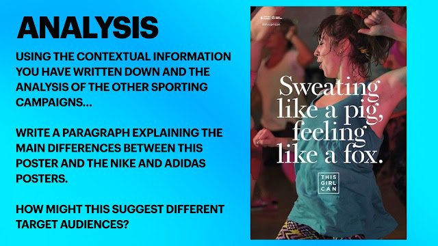
There are many differences between the advert above and the posters I have seen. The reason for which I say that is because in the posters, the women that are present in them are very serious and look like they are trying to get fit in a very serious matter. However, the woman in the advert above is enjoying herself as she is trying to be more active, this tell us that women can enjoy themselves as they work-out and do not have to do things the way people feel they should, seriously. The phrase 'sweating like a pig' is a very common phrase that is used to say that somebody is sweating a lot. That phrase may be used to imply that women are represented as strong-willed and perseverant. The other part of the phrase 'Feeling like a fox' also says that because she is working-out and being active, she is feeling like a fox, which is another way of saying that she is feeling 'sexy'. This shows that she is feeling sexy as she is sweating a lot, losing weight, and just feels more confident in herself. The way that she is feeling more confident in herself tells me that what the "This Girl Can' campaign is trying to do, is working. we can see this as the woman looks very confident in the advert and looks like she is enjoying herself but most importantly she looks safe which is what the 'This Girl Can' campaign is all about.
Friday 2nd February 2024
Advertising Set Text *2*
LO: To analyse the construction of the 'This Girl Can' set text.
Do Now:
The 'This Girl Can' advert is very different than the poster as it includes a wider range of women for their audience. For example, while the poster involves a white woman who is quite fit and is about middle-aged. However, the advert shows a a larger variety of people as it shows people with different ethnicities, ages, and body types. This is showing how the 'This Girl Can' campaign is very inclusive when it comes to wanting women to feel more confident when they are working out and feeling safe.
The way in which it can show us that they want a wider audience is because it is a video, therefore it is easier for them to appeal to others.
Connotations:
Sweat - Hard-working, Perseverant
Pig - Dirty, Cute
Fox - Sly, Cunning
Lexis:
- There are two similes in the 'Mantra' used in the advert.
- 'Sweating Like A Pig' & 'Feeling Like A Fox'
- One is a negative and the second flips the negativity on its head and makes it a positive.
The 'This Girl Can' advert has used the phrases 'Sweating Like A Pig' & 'Feeling Like A Fox' to break the stereotypes that women cannot do active things, or play sports, etc. Although, 'Sweating Like A Pig' could tell us that it will be sort of slimy, disgusting, etc. The 'Feeling Like A Fox' phrase challenges that by saying that it is worth it.
Typography:
- They have used a serif font because it is a more feminine font which links back to their campaign which is directed towards women.
Main Image:
- Centred mid-shot - showing from the waist / hips up filling the frame - This is used so we as the audience can put our attention on her upper body and can see that she is being active and 'Sweating Like A Pig' which is shown through her hair also being sweaty.
- Not a female celebrity, but a woman in her 30's - This shows that the poster is made to appeal to a wider range of women as it doesn't have a celebrity or a extremely fit person.
- Hair scraped back in a scruffy ponytail - This shows that she has been doing it for a while but it also shows that she doesn't care about what other people think about her as she is not caring about how her hair looks while she is working-out.
- Sweaty - No / minimal makeup - This is showing that she is confident in what she is doing which is what the 'This Girl Can' campaign is trying to achieve.
- Workout / active-wear (clashing colours) - Seeming as the colours just didn't work together tells me that she does not care about what other people think about. Also, the bright colours could make the advert stand out.
- Eyes closed with a slight smile - This could mean that the women it is aimed at could be tired as well but very happy with the results they will get from exercising.
- Other women in similar positions in the background (out of focus) - This shows how a large amount of people want to do it. It also shows that she is not alone while she is doing her exercise.
Additional Media Language:
- There is a 'National Lottery' logo which shows their involvement and they are the organisations behind the campaign.
- The use of the hashtag will hopefully connect women with other like-minded individuals and create a sense of social cohesion, thereby further reinforcing the message and encouragement among audience members. It also links to the main Youtube advert.
Comparisons:
Similarities:
- They both use mid-shots to show importance to one of their messages.
- They both use serif fonts for their main texts, but they used sans-serif for their logos.
Differences:
- Quality Street is a company / brand. Where as, 'This Gil Can' is an organisation ran by two different things (the National Lottery & Sports England).
- Quality Street is used to objectify women. Where as, 'This Girl Can' is used to empower women instead and boost their confidence.
Wednesday 7th February 2024
Representation and Theory
LO: To explore the representations in the set text and apply relevant theory.
Do Now:
The intention of the 'This Girl Can' campaign is to encourage women to exercise without fear of judgment. They aim to ensure women feel safe and comfortable while exercising, as 22 percent of women reported that they are concerned about sexual harassment.
Dominant ideology:
Dominant ideology is the attitudes, beliefs, values, and morals shared by the majority of people in a given society.
The UK - Liberal-democratic.
Cornwall - Pasties.
Campaign Agenda:
- Encourage women to participate in physical activities by challenging the dominant ideology about women's relationship with exercise.
- The dominant ideology is that women cannot exercise because they are too weak or too precious. A lot of people believe that women cannot exercise if they don't look stereotypically 'perfect', or that they cannot work out without judgement. A lot of people see women as unwilling to get sweaty and dirty, and therefore unwilling to exercise.
- They seek to challenge this through their campaign by using ordinary women in their adverts to show that anyone can exercise, free of judgement and free of the constrains that society puts on them. Using regular women who are enjoying themselves allows them to challenge this because it shows every single woman that not only can they exercise, it can also be fun and be enjoyable.
Challenging stereotypes:
- Stereotypically, women have often been thought of as the 'weaker' sex and often less successful where sport is concerned.
- I think it has come a long way from what it used to be, however women are still thought of as stereotypically 'weaker', not only in sport but everywhere as some people think. This is not an accurate representation, and a lot of the world has moved on from this kind of thinking, however there are still many backwards people and countries that are still in this frame of mind. The 'This Girl Can' campaign aims to change that.
1) Her facial expression creates a positive feeling about sport for the female audience because she is smiling slightly with her eyes closed, showing she is enjoying herself, and therefore showing the female audience that they can enjoy themselves too.
2) The advert seeks to encourage women to see themselves in the model they have chosen by showing that the woman in the advert is sweaty and not looking stereotypically 'perfect' but she doesn't care because she is enjoying herself and knows/feels free from judgement from others,
3) I think the title of the campaign is successful at being inclusive. The word, 'girl' is not specific to any age, size or circumstances. It appeals to all women. The word, 'can' connotes that anyone can do anything they want, as long as they don't let fear or fear of judgement get in their way. It could alienate those who are non-binary, as they are not included in the campaign, as they use the word 'girl'. However, other than that they are inclusive of anyone of any age, size, ethnicity or religion.
Theory:
- Laura Mulvey came up with the male gaze theory. The male gaze theory is a sexualised portrayal of women. By objectifying women, the male gaze represents women through the sexual desires of heterosexual male viewers. It depicts the female body and personality as an object for men to view, own, and conquer.
- I don't think we can apply it, as the advert is not catered towards men, however we can consider how the advert contradicts the male gaze theory. There are no men in the advert, showing that the women are not there for men's pleasure: they are there for their own enjoyment. The woman is there to exercise and have fun, not to be looked at by men. We can infer this from the fact that she doesn't care how she looks.
Theory: Propp
- Vladimir Propp: narrative character roles/functions.
- He says: There are a variety of key character roles that appear in almost every narrative.
The Hero - Emmet, Wyldstyle, Vitruvius
The Villain - Hans, The Duke of Weselton, Lord Business
The Donor - Dobby, Minerva McGonagall, Snape
Wednesday 21st February 2024
DIRT
LO: To revise how to answer exam style questions effectively.
- 'This Girl Can' is a positive statement connoting determination.
- Make sure to include the connotations of the elements that I select.
Explore how the print advertisement for 'This Girl Can' uses media language to create meanings:
(A) Text / Written Language
The 'This Girl Can' print advert uses media language, like text and written language, to create a numerous amount of different meanings.
The 'This Girl Can' logo is a very positive statement that connotes determination and power. This is a good thing as that is the full focus of what the 'This Girl Can' campaign is trying to do; empower women and make them feel more confident in doing exercise and various fitness things like zumba. The fact that the logo includes 'Girl' gives us the impression that they are referring to maybe much older women as young and youthful which will yet again make them feel more confident in themself but to also attempt to get them to be more active. From the fact that is states 'Girl' it is pretty much telling us who its target audience is which is basically all females, not leaving out anyone which is showing us how they want equality within women in their community supporting them, but it could also be trying to inform us that they mainly want younger women to get involved as they have the rest of their lives to live with, so they would most likely prefer to be more comfortable in their own skin. The word 'Can' is trying to tell us that they are not trying to get people to be more active but they will get people to be a lot more active. They are using 'Can' as a very positive way of saying no matter what, you can do this. It is also trying to say that it doesn't matter what kind of body type you have, you can be active and you can do what it takes to feel comfortable when working out and to feel like you can be you even when doing exercises.
(B) Visual Codes (Images, Lighting, Dress)
In the 'This Girl Can' poster, we can clearly see that the woman is enjoying herself and is happy with what she is doing without a care in the world for what others might think of her.
This is made apparent as we can see that the woman is not a stereotypically more model like woman. This is clear as she is probably in her 30's and not someone who is quite young and youthful which shows that the 'This Girl Can' campaign involves women even if they are older than the others around them. We can also see that the woman is not a celebrity in any way which gives us the idea that it does not take a super model or celebrity for people to be interested in what they are as a community and what they they want to achieve. We can also see that the woman has her hair tied back in a scruffy ponytail which gives us an impression of how confident she is by not fully being neat and tidy which is a stereotypical thing for women to be, especially in like the 60's. The fact that she also has her hair in a scruffy ponytail gives us a different idea that what the 'This Girl Can' campaign wants to achieve, will be achieved if it has not been already because of how the woman does not have a care in the world for how she looks and does not care about what others might think if they see her with a messy ponytail. The fact that the woman has got her eyes closed and her head tilted could give us the idea that the women they are trying to get this to appeal to are mainly tired, maybe emotionally or mentally but it is trying to make sure that they know that they can get involved too and do not have to feel left out. Since they have done this, we get the idea that the campaign is trying to appear to a wider variety of women. We can see that she has got a slight smile showing on her face which can tell us that even though you would be tired while doing this, you will be happy with the results and how you will come out happier and more confident with doing a different variety of exercises like running, cycling, jogging, etc. We can see that she is tired by the way she is sweaty, which is a gross thing, but it is attacked by the idea of her happiness. Seeing that she is sweaty, shows her determination and perseverance. However, it also shows us that she is in support of what the 'This Girl can' campaign wants to achieve and how they want that too and how all women around the world would want the same thing that they do.
Homework:
Historical context has influenced advertising through the way that it reflects the time in which the adverts were created which can tell us the many different key ideas and themes were present in the time of the advert being created and published. This can be seen in the Quality Street advert which portrays a man in the centre of the poster which helps to show the importance of him and how it reflects that men were seen as more respected and of higher class. this ideology of class and status can also be seen through the way that women are represented as lower than men which can be seen as they are leaning on the man on either side. This could suggest that women are dependent on men through the way that they are literally leaning on him but it could also suggest how women are more of an item that men see as something to be collected as there are more than one woman with the man. More to this, women are represented as objects and are dehumanised through the way that the two female people in the poster are represented as the Quality Street sweets. This once again states that women are more like an item than actual people within this time period and that the women are not supposed to appear as people but as objects for men which once again reflects the time period that this advert was created in.Homework:
We can see that social and cultural context has influenced advertising through the way that the 'This Girl Can' reflects the socialness of when it was made as it presents the issue of women being uncomfortable whilst working out at they gym, particularly because of men. The 'This Girl Can' advertisement addresses how women should not feel judged or bad about their body and should be free when working out. This can be seen as the woman on the poster has a messy bun and an unmatching costume which emphasises the lack of care she gives for her appearance. This shows the social context of the 'This Girl Can' advertisement as we are told that men are much more dominant than women as women are scared by men and may seem intimidating when around them. This also highlights the uncomforting nature of men within this time as they may seem invasive and all in somebody's personal space, such as at the gym.
The fact that the 'This Girl Can' advertisement was produced shows the culture and social nature at the time as it depicts how women needed encouragement when it came to working out and doing what they want to because of the fear of any unwanted attention by men or of being scared by the judgement that a woman might face. This shows society as male dominated as whilst men are seen as being out there doing what they want to and not having really any worry about judgement when working out, women feel oppressed and restricted of doing these kind of things because they are scared of men having thoughts about it. The 'This Girl Can' advertisements serves as a way of informing women that they do not need to fear the judgement from men or having any doubts that they should not be doing what they want to to feel beautiful and to stay healthy, showcasing that no matter what you look like, you can still work out and keep yourself healthy and fit.




ADVERT AIMS & CONVENTIONS:
ReplyDeleteExcellent notes
QS ADVERT:
Excellent notes and understanding of context, the use of ML & representation
QS HOMEWORK:
Cannot see this?
THIS GIRL CAN ADVERT:
Excellent notes and understanding of context, the use of ML & representation.
PPE Q1a: 3/5
Absent
PPE Q1b:
Absent
PPE Q1a: 4/5
ReplyDeleteWWW: Two clear points supported by text references
EBI - link the points to the meaning/purpose of the campaign (second point in particular)
PPE Q1b:7/10
WWW: good focus on the meanings constructed by the visual codes
EBI: make sure you link the points to the meaning/purpose of the campaign
HOMEWORK: excellent. Spot on.
ReplyDeleteCONTEXT HWK #2
ReplyDeleteExcellent - well done!