Wednesday 6th September 2023
Introduction To Media Representations
Lo: To explore the concept of representation & stereotypes.
Representation:
The media offers the audience an interpretation of the world.
It is a REPRESENTATION of the events, people and places.
I personally believe that this is a positive representation of people with disabilities showing that they can do the same thing other people can.
- Independent
- Empowering
- Confident
- Strong
- Un-typical
- Focused
- Brave
- Determined
Friday 8th September 2023
How have they used MES to create the stereotypes?
- The fact he has a podcast to show he has different hobbies.
- The fact he asked to be lab partners shows an awkward atmosphere.
- The glasses makes the character give a geeky stereotype.
- The high shorts show their geekiness.
- The hair style also shows geekiness.
- Both have their shirts tucked in to show geekiness.
- Both act awkward around each other which shows no friends.
- The amount of unnecessary equipment.
- He starts a conversation about conspiracy theory.
STEREOTYPED EXPECTATIONS!!
Nanny - Caring, Female
Nurse - Female, Young
Teenager - Moody, Anti-social
Astronaut - Male, Muscular
Football Player - Athletic, Healthy
Opera Fan - Fancy, Loud
Teacher - Bossy, Lanyard
Tattoo Lover - Scary, Male, Motorcyclist
This advert challenges stereotypes via using the phrase 'Are you man enough?' to represent the question; Are you brave enough to do a job that is stereotypically seen as a woman's job? The way that some of the men have different items of clothing and props with them is used cleverly to show that stereotypically men have those specific hobbies. This can also show that no matter what your hobby is, you will never be less of a man.
Educating The East End:
- Speaking 'Arr' language
- Students having fun
- Teachers not being monstrous
- Getting into messy situations
- Being silly billy's
- The students are very diverse
- Teachers making jokes
Pasties
Seagulls
Santa Claus
Wednesday 13th September 2023
Representations In Magazines
LO: To explore the representations found in magazines
Direct Address: When the person/model on the poster is directly looking at you hence the word 'Direct'.
Star Vehicle: This is someone famous who is on the cover hence the word 'Star'.
Cosmopolitan:
- Directed to females - The cover lines
- Might be directed to young adults - Colour palette & Star vehicle
- Could also be about health - Cover lines again
How Carrie Underwood is represented in three adjectives:
- Confident - All her confidence secrets revealed
- Physically fit/healthy - Happy in her own body
- Bold - Colours of her dress
Cover 1:
- Basic/Casual clothes - It is not over the top
- Relaxed - She is sitting calmly
- Natural - They haven't gone over the top with make-up
Cover 2:
- Strong - The way she is standing makes her look strong
- Powerful - The way she is looking down on you
- Talented - She is holding a microphone to show she is professional
Cover 3:
- Fancy - She is wearing a fancy dress
- Confident - The way she is smiling
- Wealthy - The way her dress makes her look wealthy
Cover 4:
- Glamorous - She is wearing a nice dress
- Summery - She isn't wearing too many layers
- Youthful - Able to wear revealing clothes
Friday 15th September 2023
Representations In Magazines
Lo: To explore the representations found in magazines

- Different colour palettes which are more suited to the stereotypes of their target audience (pink, purple) and (blue, black).
- The one aimed at women has a puff about abs where as the male one has no puff what so ever.
- The one aimed at males has a mid-shot however the one aimed at women has a medium long shot.
- On both of the magazine's they use a different famous person. (Carrie Underwood & David Beckham).
- The genre of both of these magazines are different.
- The outfit choices are different depending on the stereotypes. Carrie Underwood is wearing a revealing flower dress where as David Beckham is wearing a tuxedo.
The difference between how gender is being presented is in Cosmopolitan we can see it is for straight females, seen in the cover line 'Guys Made Easy'. Similarly, GQ has got cover lines about surviving in the wild and football which are stereotypically male hobbies and interests.
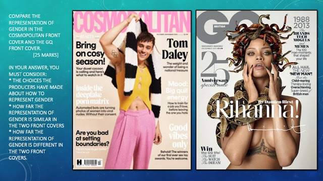
Choices:
- In GQ Rihanna is wearing no clothes, the only thing covering her is a snake.
- In Cosmopolitan, he is wearing feminine clothing which could present LGBTQ+.
- The colour palette on GQ is a bid bland where as Cosmopolitan is showing bright colours.
- GQ is presenting Rihanna as the mythical being known as Medusa.
- The Cosmopolitan magazine is showing all type of seasonal clothing from winter to summer.
Wednesday 20th September 2023
Exam Style Magazine Question
Lo: To write and structure an effective exam style question
Cosmopolitan:
- Anti stereotypical use of a male cover star
- Stereotypical representation of a gay man - pink, style
- Stereotypically 'female' topics: relationships, sex, men
- Anti-stereotypical topics: jobs, porn
- Stereotypically feminine colour palette
- More feminist representation of the modern woman - independent, strong
GQ:
- Anti-stereotypical use of female cover star for this magazine
- Sexual objectification of cover star - naked
- Negative female representation - snake, medusa, gorgan, turned to stone, etc
- Stereotypically 'male' topics: tech, status, 'man-moments', etc


The two covers represent gender very differently. Cosmopolitan represents Tom Daley is an anti-stereotypical way. For example, he has been dressed in more feminine clothing both in colour and style.
However, as a gay man, this is more stereotypical. On the other hand, there are more stereotypically masculine representations with the tattoo and the muscular physique.
In GQ, gender is presented very differently from Cosmopolitan. GQ gives a negative female representation through the idea of snakes who are vicious and sometimes deadly. The idea of the mythical being known as Medusa gives us the idea of horrifying and terrifying. On the other hand, there are a few good representations such as Rihanna being strong and independent and also very successful. We can see this by the way she is standing and her posture, she is standing tall and the representation of Medusa can tell us she is powerful.
Friday 22nd September 2023
Representation
Lo: To create magazine covers showing an understanding of representation.
Friday 29th September 2023
Exam Style Magazine Question
Lo: To review & improve an effective exam style question.
Industry Research
Lo: To research companies linked to set products
Vogue:
- Vogue was first launched in 1892.
- The original genre of Vogue was monthly fashion and lifestyle
- Their target audience was Social Elites
Homework:
The way that gender is being represented in a mixture of both stereotypical and anti-stereotypical. For example, they have used hobbies that are stereotypically for males for example, football. However, it has stereotypically feminine hobbies too. For example, wine and fashion. James Franco is in a suit and tie which is stereotypically more masculine clothing. From looking at this, we can see this is trying to both appeal for both young adults both males and females as it includes stuff about wine and showing off your assets and other mature content like 'Why no one uses condoms anymore.'
Homework:
Due Date: 1/11/2023
- Raheem Sterling is an English professional footballer who plays as a winger for Premier League club Chelsea and the England national team.
- He was awarded the Golden Boy award in 2014.
- In July 2015, he was signed by Manchester City in a transfer potentially worth £49 million.
- Sterling made his senior debut for England in November 2012 after previously being capped by England youth teams.
- Sterling spent four years with local youth team Alpha & Omega before signing for Queens Park Rangers, at the young age 10, as a winger.
Wednesday 1st November 2023
- The magazine cover consists of stereotypically male interests. E.g. Mens accessories, Electric cars and wrestling.
- Jeremy Strong is wearing a zebra coat with red shorts
- His facial expression is very serious
- He has bandages on his hands which tells us he is a wrestler
- He is sitting in a boxing ring which also tells us he a a wrestler
- His posture is leaning back on the ropes of the ropes which can show power
Raheem Sterling MBE is an English professional footballer who plays as a winger and attacking midfielder for Premier League club Manchester City and the England national team. Born in Jamaica to Jamaican parents, Sterling moved toLondon at the age of five.
Sterling was the fifth youngest player to represent England when he played against Sweden in 2012. In 2016, Sterling was the nation's most expensive player when he was bought by Manchester city.
In December 2018, whilst playing against Chelsea, Sterling was subjected to racist taunts from Chelsea fans.
In 2018, Sterling was subjected to racist taunts and comments from Chelsea fans.

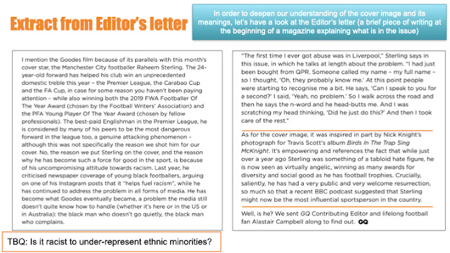

Anchorage Text:
Guardian Angel - A multitude of meanings and readings.
- He is a winger in football, playing on the sides or the wings.
- He protects other black players from further racial incidents through his campaigning.
- He was seen as an 'evil' person, but in reality seems on the whole to be a good one.
A Z-Pattern design traces the route the human eye travels when they read - left to right, top to bottom:
- First, people scan from the top left to the top right, forming an imaginary horizontal line.
- Next, down and to the left side of the visible page, creating an imaginary diagonal line.
- Last, back across to the right again, forming a second horizontal line.

Wednesday 8th November 2023

Gender and Ethnicity Representations:

- The male model is shirtless to show his abs and how strong he is which can show power.
- Confident as he is looking dow on you.
- Male footballer which is a stereotypical male sport.
- GQ suggests two male heroes and two female hero.

- The male model looks intimidating.
- The GQ heroes represents both gender and ethnicity.
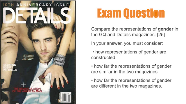
- Female's are represented as over sexualised.
- Male's are shown to be more powerful and confident from the word 'Remasculation'.
- Men are also shown to be sexualised as the model has got his shirt unbuttoned a bit showing his chest.
Wednesday 15th November 2023
Malala Yousafzai
LO: To explore the context & cover star for case study 2
Do Now:
- Fashion and lifestyle magazine
- Multiplatform
GQ/RS RESEARCH & NOTES:
Detailed and thorough
GQ COVER ANALYSIS:
Good notes
GQ EXAM Q:
Absent

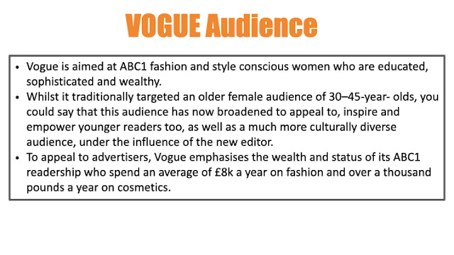
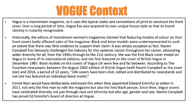

Vogue has changed over time as from August 2002 and 2014, 146 covers had been shot, edited and put in newspaper stands and not one of them had an individual black model. This has changed as we have now had more individual cover stars of different ethnicity's.

Media Homework:
Due Date: 17/11/23

The way that gender is represented in GQ and Details is quite similar. In GQ, we can see the black male model standing in a confident stance with his legs spread open which can make them feel powerful. The model has his head slanted and slightly back which can tell us that he is meant to be seen like he does not care about anything which defeats the purpose of him being a 'Guardian Angel'. We can see that the male model is shirtless to show his strength but also his tattoos. The cross around his neck links to the idea of religion which can then link back to the idea of a 'Guardian Angel'. His tattoo's can connote that he is sinning as marking your body with anything is seen as a sin. This contrasts with the idea of a guardian angel which then can make this seem like a good vs evil sort of scenario. Even though we see the model as an 'Angel' he has got black wings which can yet again suggests the idea of good vs evil but also the idea of him celebrating 'blackness'.
Similarly, in the Details magazine we can see the young white male model sitting in a seductive way which can also be seen as a powerful position to be sitting in. We can see that he has got his top buttons of his shirt undone showing his confidence but also showing part of his chest. We can also see a woman sitting behind the model with each leg over his shoulders. This can show us that females are represented as over sexualised. We can see that the model has got his hand resting on the female models leg which can then show that men can also been seen as sexualised but not as sexualised as women are represented as in the magazine. However, we can see that in the GQ magazine the black male model is fighting for something good unlike the white male model in Details who is just 'fighting' for the 'remasculation' of men which is nowhere near as important as the GQ magazine.
Friday 17th November 2023
Malala Yousafzai
LO: To explore the context & cover star for case study 2

Summary of Malala:
We know that Malala was shot in the head for attending to school, but miraculously survived. She is now currently fighting for girl's education. During an interview, she shares her concerns for the safety of women and girls in Afghanistan. Malala is seen as an education activist opposed to the Taliban.

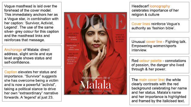
- The same classic Didot font has been used for the VOGUE masthead since the 1950's; perhaps it is now better known as the Vogue font.
- The all-uppercase serif font gives it a classic, architectural look, an aesthetic that commands respect.
- Tall, slim and sculpted, the letters proclaim their own statuesque style.
- The word vogue means something that is trendy or popular.
- The VOGUE masthead is always capitalised and centrally placed, like a banner across the top of the magazine.

Main Image:
- Looking at the camera, medium close up - This makes her look powerful and also shows us that this is meant to be direct address.
- Malala is wearing a hijab because she is a muslim and it is also the colour red just like the background of the magazine.
- Malala is represented as a 23 year old muslim woman who is fighting for girl's education.
- She is wearing a hijab as that is part of her religion, she is also wearing some rings that can show wealth from the amount of different things she has done for girl's education. E.g writing a book, doing interviews, etc...
- They have used a medium close up and have used a face height angle which is showing her power. She is also staring at the camera which is showing direct address.
Anchorage:
- The white contrasts with the red to make the name stand out to the audience and to celebrate her name and status her name as this role model.
- The text is white against a red background with the name Malala as the biggest thing there.
- This is to represent her as a high achieving woman with titles such as 'survivor, activist, legend'
- The writing is white and the name is the biggest text there to draw your eyes towards who it is about and what it is possibly about too.
Cover Lines:
- This all connote to women's interests but also a lot of stuff about survival and reshaping peoples views about different things.
- The cover lines are black and white with the black in all caps and the white with a mixture of capitals and lower case.
- The writing is mostly acrylic which can tell us about the different kind of things that are in the magazine.
Layout:
- Using black and white text can connote equality because that is what Malala is fighting for, girl's education around the world.
- VOGUE is in front of her head because otherwise you probably would not know what kind of magazine you are reading.
- The layout is used to represent a Z shape so that you would read the magazine in a specific way without you even realising that you are doing it.
- This forms a Z shape.
Wednesday 22nd November 2023
Malala Yousafzai
LO: To explore the representations in case study 2
Do Now:
Three ways media language is used:
- Red can connote passion and the danger she lived through and also connote to power.
- Direct address (staring into the camera) shows confidence.
- Mid close-up shows passion to what she does.
- Malala is the biggest text to show it is about her and show her importance and status as the main cover star.
- Wearing a head scarf because that is her religion.
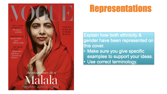
Vogue is far more diversity, not just racial but across the board. Age, race, sexuality, etc. Before 2017, Vogue U.K. went 14 years with only six nonwhite solo cover stars; this year it hired 16 out of 28 nonwhite women, not to mention its first (publicly) transgender cover star.
Ethnic Representations:
- The main image is of Malala who is a muslim which we can see from her headscarf.
- Represents black people in the cover lines.
- Malala as a muslim woman is very anti-stereotypical.
- In terms of age, it is a very narrow representative.
Gender Representations:
- According to the cover lines, women are represented stereotypically with things like love, fashion and summer beauty.
- Women are represented in a positive way, via they are represented as confident which is very anti-stereotypical for magazine covers.
- Women are represented as strong and powerful and confident if you look at how Malala is presented, as a survivor.
- There are also some anti-stereotypical subjects like sports.
- Malala looks very feminine; flowing, silk, jewellery, headdress, make-up.
- Classy and sophisticated - colour palette and cover image.
- Malala anchorage - depicts strong, powerful and confident woman.
DEL : Structuring My Ideas
Describe - The technique/element/representation used.
Explain - The connotations/meanings constructed.
Link - To the overall context/meaning
The main cover image is of Malala who is a muslim which we can depict from her headscarf. In the cover lines we can see that Jourdan Dunn and Anthony Joshua who are black people in there 20's. This is showing us how far ethnicity has come with in the timeline of vogue as before 2017 not many ethnic people were presented in a magazine alone. This overall tells us that ethnicity is represented in a more positive way now as more solo ethnic people are being presented in Vogue magazines.
Friday 24th November 2023
Malala Yousafzai
Lo: To compare representations in magazine covers
Do Now:
Three words to describe how gender is represented:
- Confident
- Empowering
- Inspirational
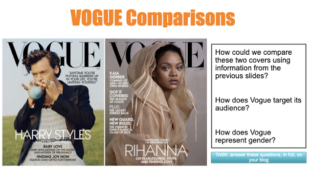
Oui, c'etait tres amusant.
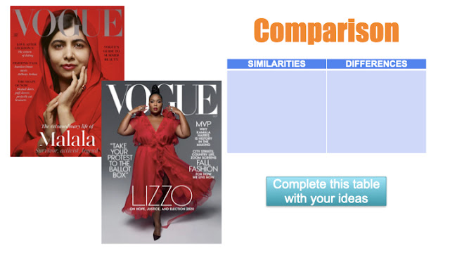
Similarities:
- The colour red, they are both wearing it - Connoting power and confidence.
- Both ethnic women.
- Direct address to also show confidence and leadership.
- Name is biggest text on the magazine which shows importance and highlights there status.
- Both wearing jewellery to show status and wealth.
Differences:
- Different ethnicities.
- Different shot types which can show power and control.
- Different colour of the word 'Vogue'.
- Contexts are all same colour in the Lizzo magazine where as they are black and white on Malala one.
- Different religion.

Wednesday 29th November 2023
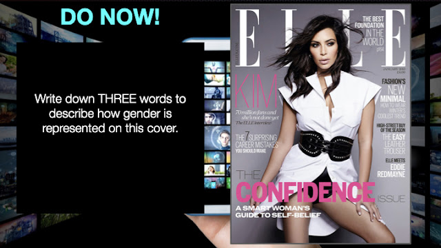
- Confident - Her stance
- Stereotypical - Feminine interests
- Beauty - The make-up she is wearing and the way she is dressed
- Empowering - Her facial expression
LO: To practice comparing representations in two covers

Similarities:
- Both females - Do not need much proof for this.
- Both ethnic people - Head scarf
- Stereotypical feminine topics - Fashion, beauty
- Both wearing jewellery - Status and wealth
- Black and white cover lines
- Their names in big text - Showing status and importance
Differences:
- Different shot types - Focus on stance - Focus on facial expressions
- Different colour palettes
- Not both doing direct address - Showing power
- Different amounts of make-up - Advertising
- Masthead in front or behind their heads - Showing importance

While there are more similarities between the 'Vogue' magazine and the 'Elle' magazine, there are still a few differences between the two that separate them from becoming the same thing.
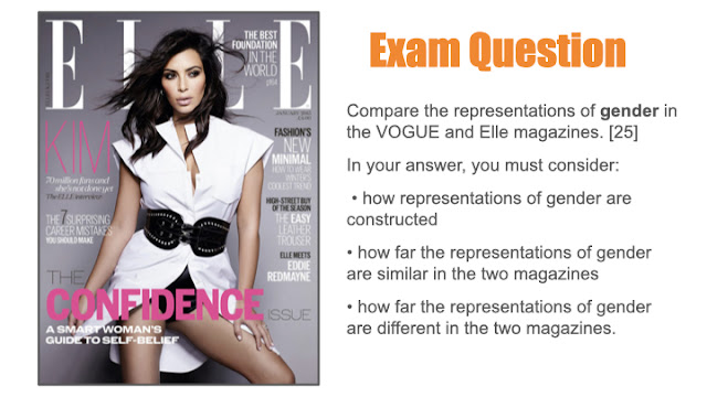
We can see the use of one of these similarities when we see that they are both wearing jewellery. For example, in the Malala magazine cover we can see that Malala is wearing rings which can present to us her status in life, which would be rather high after what she has been through but also from all of her involvement in girl's education, going as far as writing a book about it. Similarly, in the Kim Kardashian magazine cover we can see that she is presented with a lot of wealth and success from her career in life. We can see this from the ring on her finger which tells us that she has had to of had a lot of success to be able to afford something like a ring. This is representing gender as wealthy and successful.
Another way that these magazines are similar is through the very stereotypical topics of women. We can see this in the Malala magazine cover where the cover lines suggest stuff like 'Love after lockdown' which can relate a stereotypical feminine topic, 'love'. However, there is a cover line that states 'Fighting Talk' which is mainly a masculine topic 'Fighting' but in this case it is talking about empowering topics. For example Malala is fighting for girls education. Just like the 'Vogue' cover, 'Elle' is representing topics like beauty and fashion. This is seen where we can see the cover line 'The best foundation' which is referring to make-up which can also link back to the idea of beauty. 'Elle' magazine also talks about fashion, 'How to wear winter's coolest trend'. Firstly, great pun, but also it is referring back to the idea of winter clothing and extremely stereotypical feminine topics like fashion and clothing. This tells us that gender is represented as very stereotypical.
On the other hand, where as in Malala they have used a medium close up to draw your attention to her facial expressions, the Kim magazine cover is luring your attention towards her stance. Malala has got her hands together which can make you focus on her face in some weird way. She is using direct address which makes her seem very confident but it can also show her leadership which also refers back to how she is the leader of different things connected by her fight for girl's education. However, in the Kim magazine, we can see that they have used a medium long shot which can avert your attention towards her stance. Her stance makes you see her as unbothered as she is looking away form the camera but also she looks very empowering as she is is sort of leaning to the side which can make the person looking at the magazine feel empowered by the way she is standing. The way that her hair is flowing makes her seem more whimsical and very important but also her beauty as stereotypically in movies when they introduce a beautiful girl, sometimes they make her hair fly to present the idea of their looks.
The way that they have used the colour palette is very similar. Meanwhile, the way that the colours are represented is very different to each other. We can see this as in the magazine about Malala, they have used red and silver which are not very stereotypically colours for femininity, but they are colours which can represent the idea of luxury and back to the link of wealth. The way they have used silver as a colour was a way for them to draw attention towards their magazine but it also could suggest how their magazine is more luxurious to other magazines. This is very different to the representations of the colour on the Kim Kardashian magazine cover because while the pink is a very stereotypical feminine colour. The black and white contrast that idea as they are not very stereotypically feminine colours. The black and white colours could possibly suggest that it is more stereotypically linking to a more masculine colour.
I would say that they have not gone too far from the same amount of differences as they have the same amount of similarities. I believe that both of the magazine covers have got an equal amount of both which I would say could link back to Malala's fight for equal rights for girl's education.
Re-Conclusion: I would say that the 'Vogue' magazine compared to the 'Elle' magazine, they are very similar. We can see this as many points like 'the feminine topics' and 'jewellery' are discussed between the two magazine covers. The feminine topics are very stereotypical to the idea of femininity of the magazine covers. Also the main star vehicles are both females which is why they would have both resulted in stereotypical feminine topics.
Friday 8th December 2023
Dirt
Miss Mac's Feedback:
WWW: detailed and appropriate analysis of both products with accurate terminology
EBI: I think you can be less vague with your judgment - especially in the conclusion. You say that there are both similarities and differences, so decide whether there are more of one than the other. It can't be wrong!


MAG REPRESENTATION EXAM Q:
ReplyDeleteWWW: you've compared both covers well and included gender stereotypes
EBI: include more specific connotations in your answer
HOMEWORK - GQ COVER
ReplyDeleteSome great points. However, this is targeted at men so what does that suggest about the representation?
GQ/VOGUE RESEARCH:
You will need to catch up with this George
GQ/RS RESEARCH & NOTES:
ReplyDeleteDetailed and thorough
GQ COVER ANALYSIS:
Good notes
GQ EXAM Q:
Absent
REP HWK:
ReplyDeleteA fantastic comparison - detailed and accurate with a clear comparison. Well done!
VOQUE COVER NOTES:
Excellent
VOGUE COVER MEDIA LANGUAGE:
Thorough & detailed analysis
VOQUE ML HWK:
I couldn't find this. Did you do it?
VOGUE REP NOTES:
Excellent
VOGUE EXAM COMPARISON Q
19/25
Excellent work!
WWW: detailed and appropriate analysis of both products with accurate terminology
EBI: I think you can be less vague with your judgment - especially in the conclusion. You say that there are both similarities and differences, so decide whether there are more of one than the other. It can't be wrong!